The good, the bad and the ugly of race shirts
A couple weeks ago I wrote about my dislike of the San Francisco Marathon’s half race shirts this year. I also mentioned that everyone has widely differing opinions on race shirts. Some people aren’t satisfied with any shirt they are given, others wear everyone with pride.
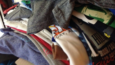
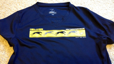
I think I fall somewhere in the middle. I have mixed feelings about race shirts in general. I get excited to potentially get a new workout shirt that screams “look what I did.” But I also, as evidenced in the photo above, have way to many race shirts. I’ve opted out of some shirts. Then when I get a really good one, I’m usually excited.
But I also have a lot of bad.
That’s discouraging because the shirt comes as part of the race admission. I pay to run. I pay for the supplies along the course and the use of portable toilets. I also pay for my shirt and my medal.
I know it’s not what running is all about, but when you want to show people your pride for running a specific event you can’t do it if you don’t like the shirt. So, I figured I’d share the good, bad and ugly of what makes a race shirt either worth it or not to me.
THE GOOD
I mentioned before that I like clean design and simple lines. I want a race shirt to say the name of the event, without throwing it in your face. I have two favorite examples of this, which happen to be from my first half marathon and marathon.
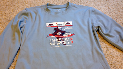
My California International Marathon one is about as basic as a shirt gets. No frills, no sponsors. Just a nice, functional shirt. And I love it. I love that I was given the option of a short or long sleeve, obviously I took the long sleeve. I love the basic color. It’s a great shirt. Because of that, I wear it all the time.
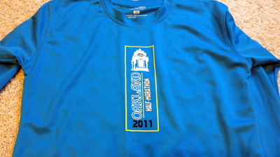
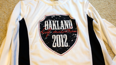
My 2011 Oakland Half Marathon shirt is also a great one. Again a basic, simple front design. The logo doesn’t look weird across my chest, which is wider than some women, I’ll admit. The sponsors are listed on the back, but aren’t huge either.
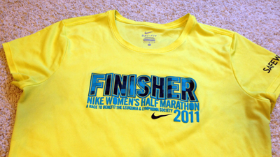
Funny thing about my Nike Women’s Half shirt is that a lot of people complained about the color. More people complained about the Safeway store logo being on the side. I loved the color, the plaid texture in the letters and the fit. Nike makes gender-specific shirts that are always the same size as other Nike apparel. So it was easy to pick the best shirt for me. I don’t mind the store logo either.
Brazen Racing makes a habit of having awesome race shirts. They also make a habit of putting on top-notch races, so this isn’t anything new. Between the company’s medal design, T-shirts and low price, Brazen puts on the best runs in the Bay Area.
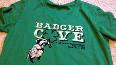
Brazen also takes into account where and when the races are, including a St. Patrick’s Day run this year in Livermore, close to my house. The Badger Cove one is a perfect example of that. I only own two green race shirts and I love the color.
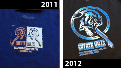
Brazen has a tendency to be repeat offenders when it comes to awesome shirts. Here are my past two shirts from the Coyote Hills run near Fremont. Same logo, different design. Both fit well. I’ve run other races in the 2011 shirt.
What makes these shirts good? They are cut specifically for women. All are a tech material. No cotton. All fit me the way I want a running shirt to fit, which is tight, but not too tight, and definitely not baggy around the mid section. That always just seems to add extra bulk to me.
THE BAD
A shirt can be nice, but not functional for me. Unfortunately most of the shirts I get fall into this category. I love them, but don’t wear them all that much.
I wish this shirt worked for me, but I find Brooks shirts to be inconsistent. I’ve bought mediums that fit me perfectly and larges that are too small. It’s kind of across the board, especially when they are made from different material. This one is more mesh and is too big in my mid section.
This one is WAY too big. It’s a unisex size and I drown in it. It also has a weird consistency to the fabric, which kind of feels funny when I wear it. I noticed a bunch of people cutting the sleeves and neckline on this shirt at the race. This has been in my “wear to stain furniture” pile for some time now.
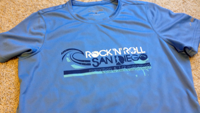
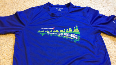
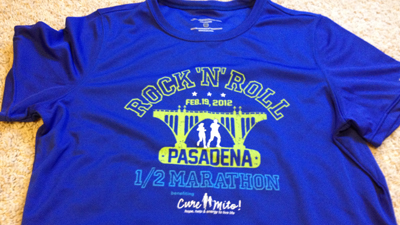
Same issue with this shirt: Just too big. It’s a unisex size medium. I didn’t know Rock ‘n’ Roll races had a tendency to make unisex shirts when I signed up for this race. I was really disappointed. I literally swim in it. I love the color an design, but I’ve never worn it.
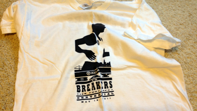
A shirt company sponsors Bay to Breakers, which would make you think that they’d have some wicked awesome shirts. Nope. Last year, it was a plain white shirt. Even the volunteers got better ones. Those ones were brown, with nice light brown screen printing. The runners got over-sized cotton T-shirts. Worse yet, this year Bay to Breakers charged a ridiculous amount of money for “plus” and “premium” registration with poorly-designed, cheaply made shirts again. Even the Adidas tech shirt was overwhelming and huge. Never again.
THE UGLY
And then there’s the shirts I just don’t wear because I’m not a fan. At all.
This year’s Oakland Running Festival took cues from local sports teams and made their shirts color-coded. The half was done after the Oakland Raiders. I’m not a Raiders fan. That’s not to say the Raiders aren’t a good team or anything, I just don’t watch a lot of football outside of following my California Golden Bears. I’m not in love with this shirt because I think the first thing people think of is Raiders and not a marathon. Marketing fail.
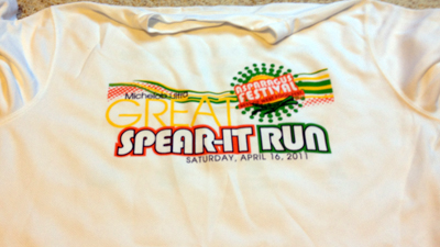
This was the first year of this half marathon and the shirt was just lackluster. It honestly felt like the back of a shirt to me and not the front. The back has another big design with a rose, a symbol of the Rose Bowl in Pasadena, but it really just looks like they couldn’t decide which design should be front and which should be back.
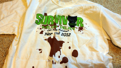
Simulation mud? Really? Add in the Comic Sans type on this cotton shirts and it’s a race shirt disaster. It’s actually in a donate pile now. I won’t wear it. And to think, some people were worried about getting their shirts muddy after the race. I would have given them mine.
THE EXTRA ONES I BOUGHT
There are some races that despite the not-so-great race shirt, I still want a memory from the race. I’ve bought several “extra” race shirts, including spending a little too much at the Nike Women’s Half last October. Sometimes it’s worth it to spend a little extra for a shirt that I’ll wear a lot.
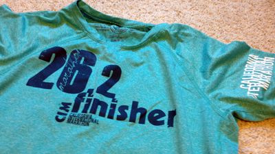
When I saw this shirt at the expo at CIM I told Thomas that if I finished the race and didn’t die, I wanted this shirt. I was true to my word too. Literally after I got myself put back together we went over to the booth to buy this one. It fits a little weird, but I have a larger back than most people. I love the modern design and the prominence of “26.2.”
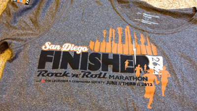
I didn’t realize I’d taken photos of two marathon shirts, but I think it’s fair that I bought both because I wanted a little something in addition to the race shirt from each marathon. I love this shirt. I have a one that’s nearly identical from the Pasadena Rock ‘n’ Roll Half Marathon, which I bought in lieu of the race shirt I posted above. I love this shirt because it fits well and is a nice, smooth material.
I’m actually considering sending it a bunch of my shirts to get a quilt made. I’ve seen a couple companies that will make them for a relatively cheap rate. I like that I’d be able to use the shirts again. Right now, most of them aren’t getting much use sitting in a pile in my closet.

Run with me!
Save 25 percent all See Jane Run races, including the June 21 San Francisco Bay Area run, by using the code SJRAMB243. Use the code to also save 10 percent on online store discounts at seejanerun.com.

